What is Money Space?
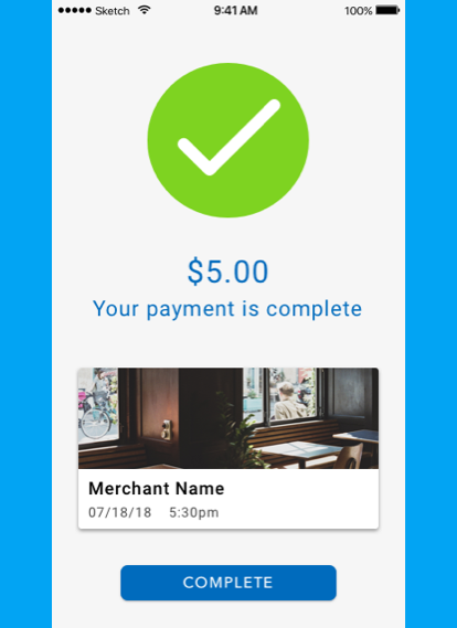
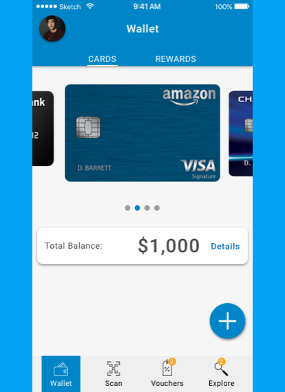
Money Space is a mobile cashless app that allows users in Thailand pay and purchase almost anything within the app via QR scan. With a growing population of cashless apps users in Asia, Money Space thrives to make purchasing within an app more simple and efficient.
Project Overview
Money Space wanted me to bring this concept into a fully functional app. Since I was developing this app from conception, it was necessary to approach this project in a lean UX process of research, synthesis, ideating, and prototyping.
C&C Analysis
I conducted a Competitive and Comparative Analysis of cashless apps in Asia and other parts of the world to get a better understanding of the features and process of purchasing through a app. I discovered that all of the apps had a QR scanning feature using the mobile phones camera to scan the QR code to purchase an item easily and efficiently.
C&C Conclusion
After researching and reviewing each company I noticed that a majority of these apps were flooded with features. WeChat allows users to do multiple things in their app. Some might say too many, but they are allowed to do this because many people in China use the app on a daily basis. Knowing that cashless apps are still pretty new in Thailand, I wanted to focus on creating the navigation as simple and intuitive.
Challenges With Research
Researching cashless apps outside of my country was a challenge. I was able to download most of the apps I researched but I wasn’t able to make an account because I didn’t have a phone number of selected countries that the app serviced to. This made it difficult to understand cultural standards of purchasing and seeing the process in which these apps work.
Discovering Solutions
Since I couldn’t learn the functionality of these apps from my own phone I had to find other ways to learn. I discovered tutorial app videos and people showing the process of purchasing various items and services which gave me a better understanding of how these apps work.
Feature Prioritization
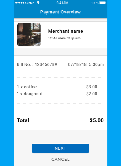
Cashless apps have the versatility to pay for a variety of different things from buying items in a store to delivering food or paying at a restaurant without waiting for the waiter/waitress to give you the check. Since this was a brand new app I wanted my design to stick to the MVP and focus on making the navigation and payment process intuitive.
Sitemap & User Flow
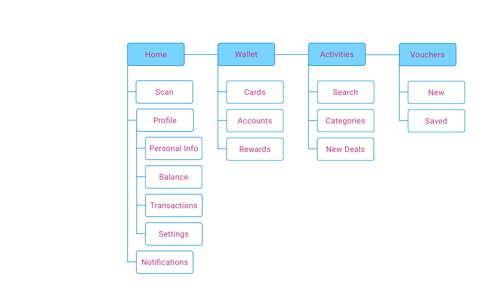
From my feature prioritization I narrowed down the global navigation into 4 features. Here you can see the hierarchy of features within the global navigation.
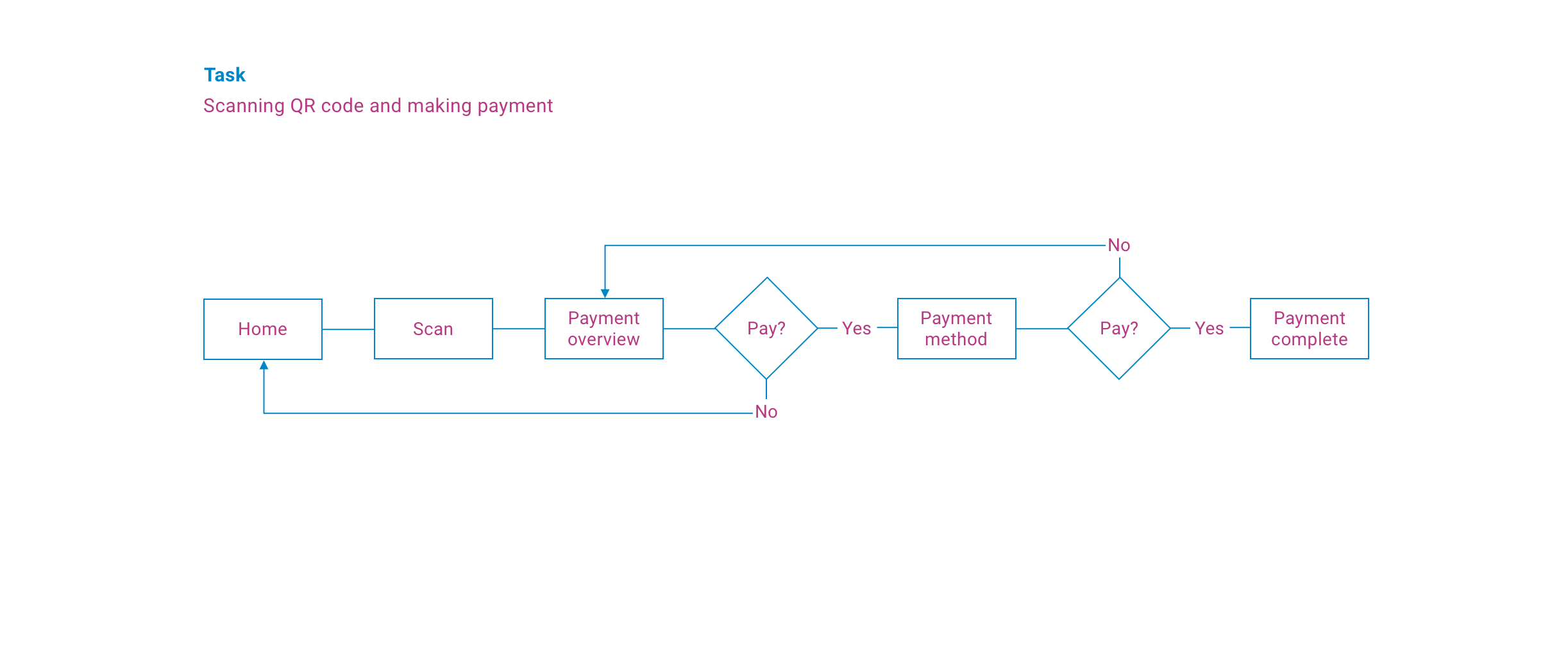
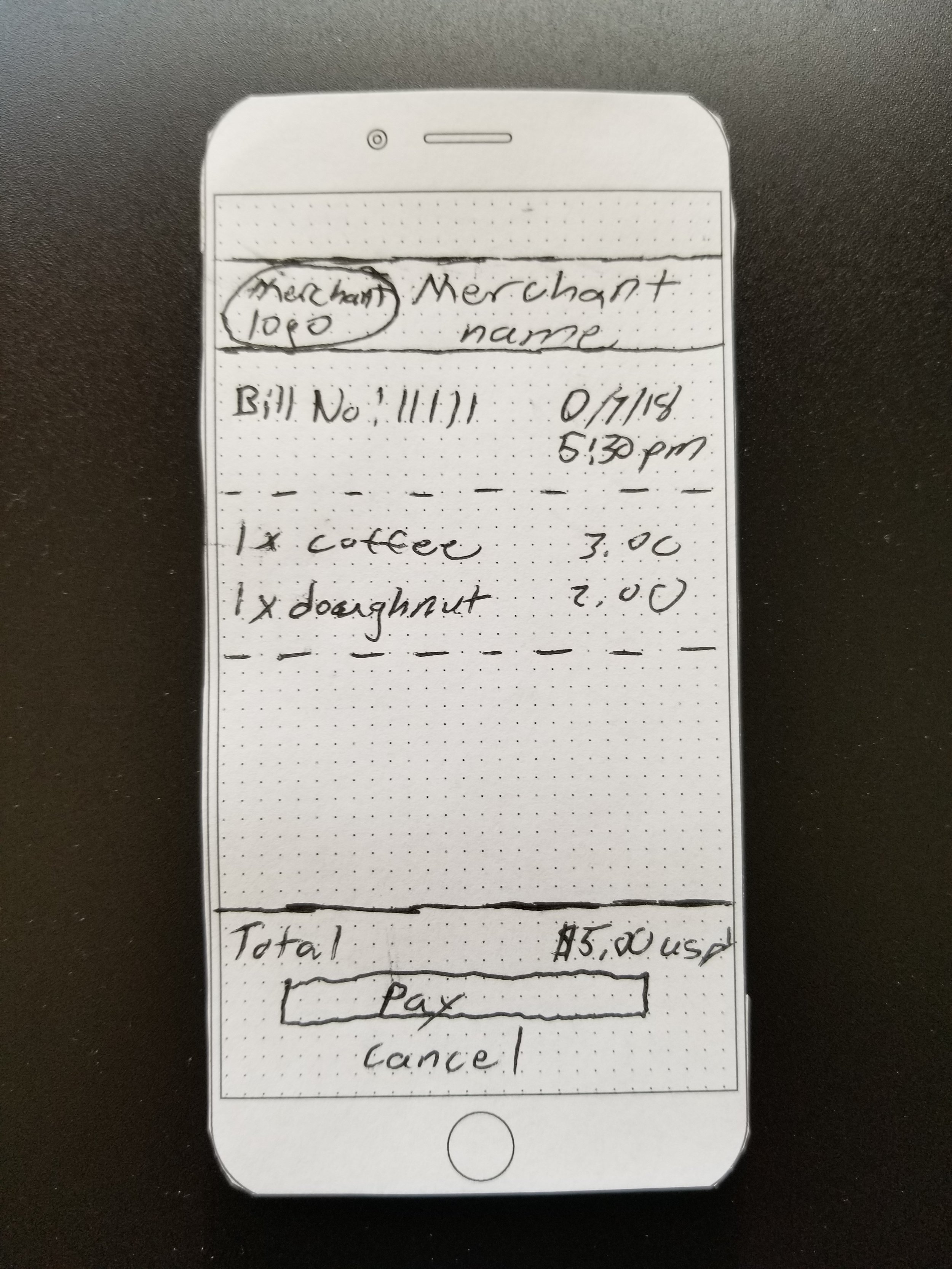
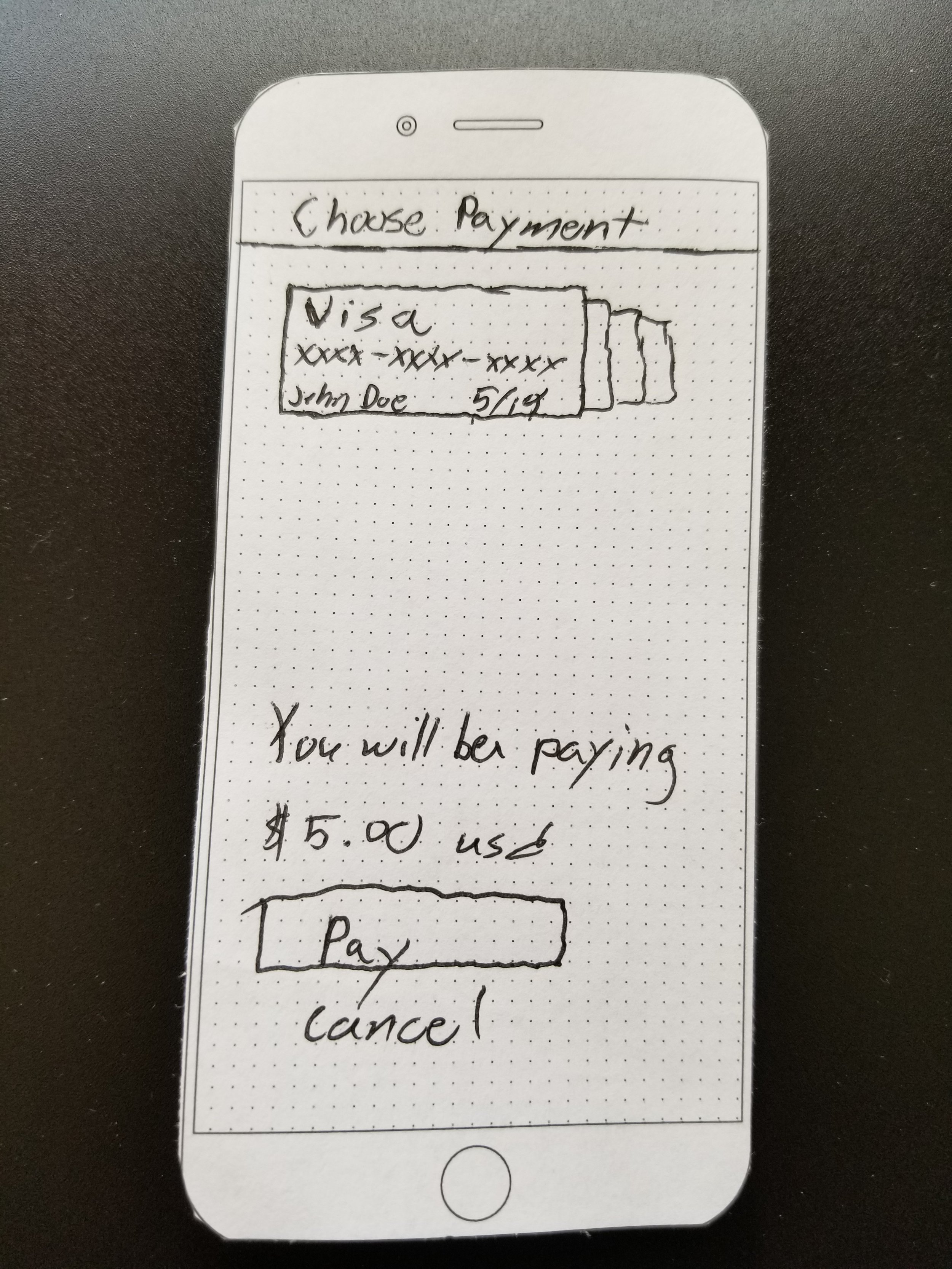
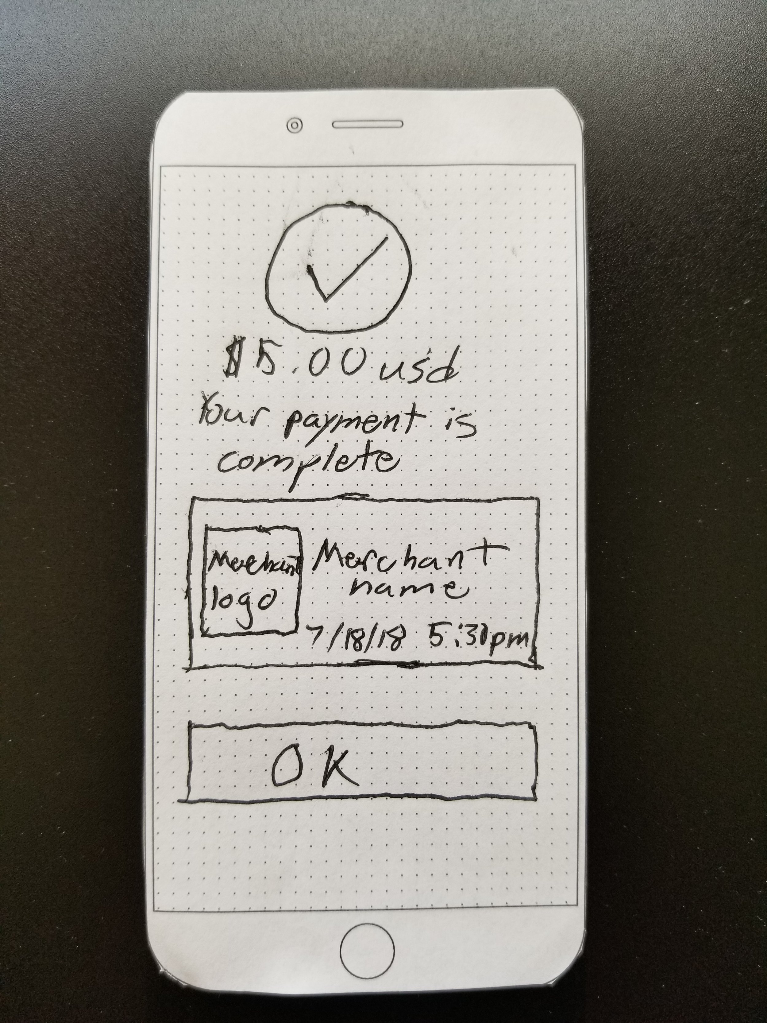
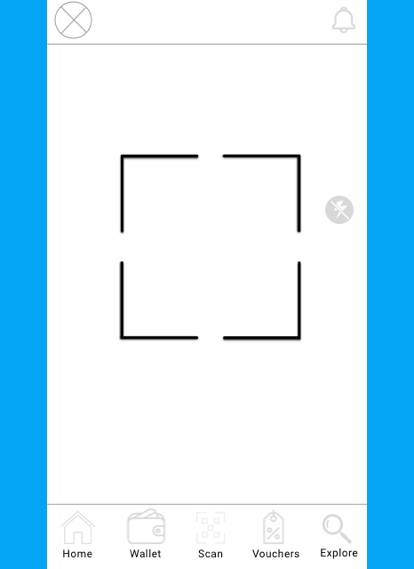
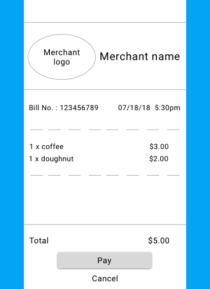
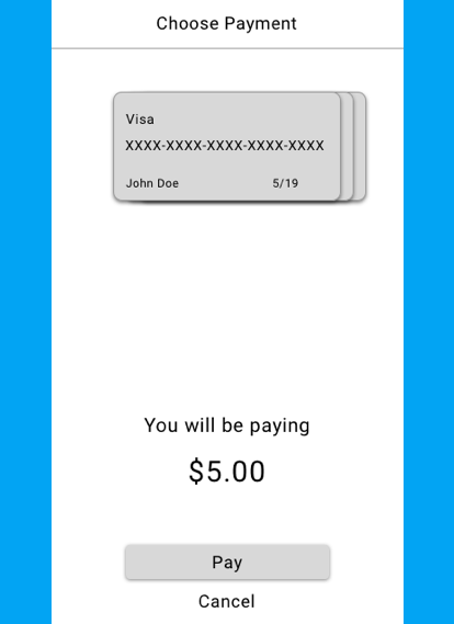
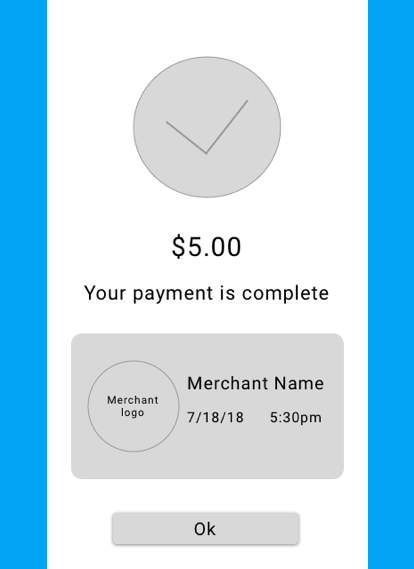
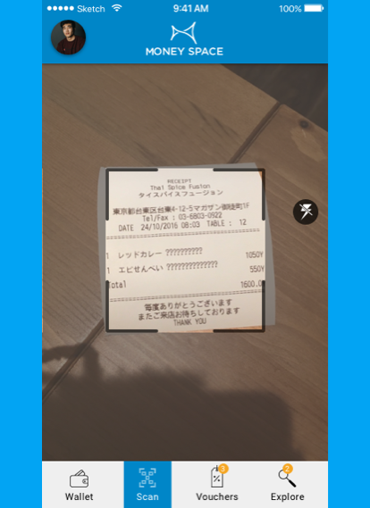
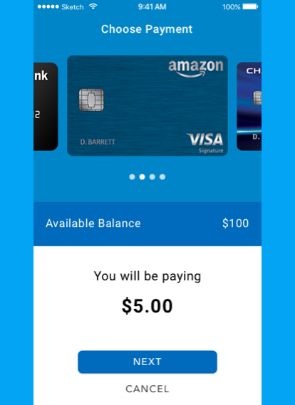
The user flow shows the process of purchasing via scanning a QR code and choosing a payment method. It was important to me to make this process as simple and efficient as possible knowing that this will be the primary function of the app.
Sketches
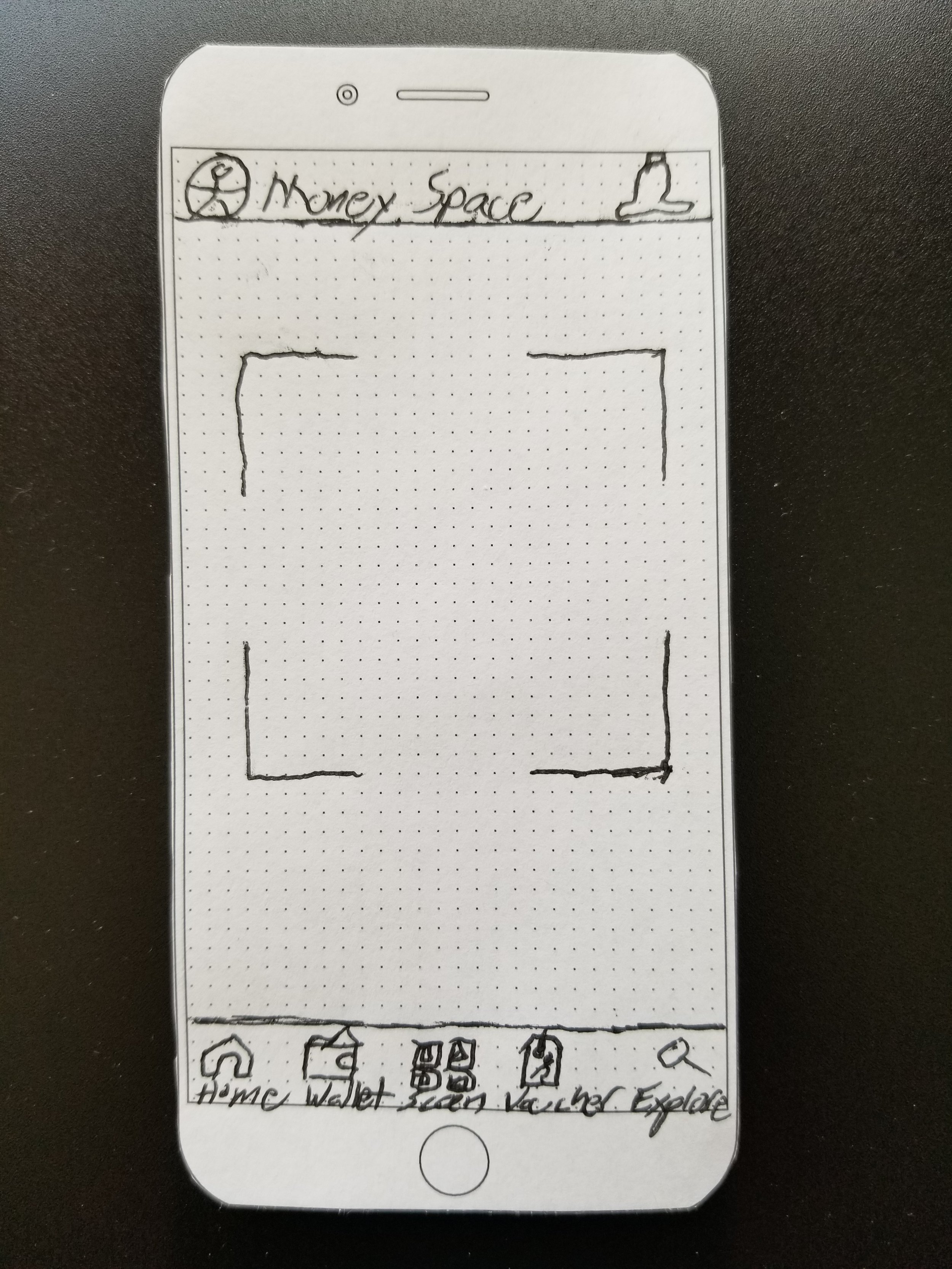
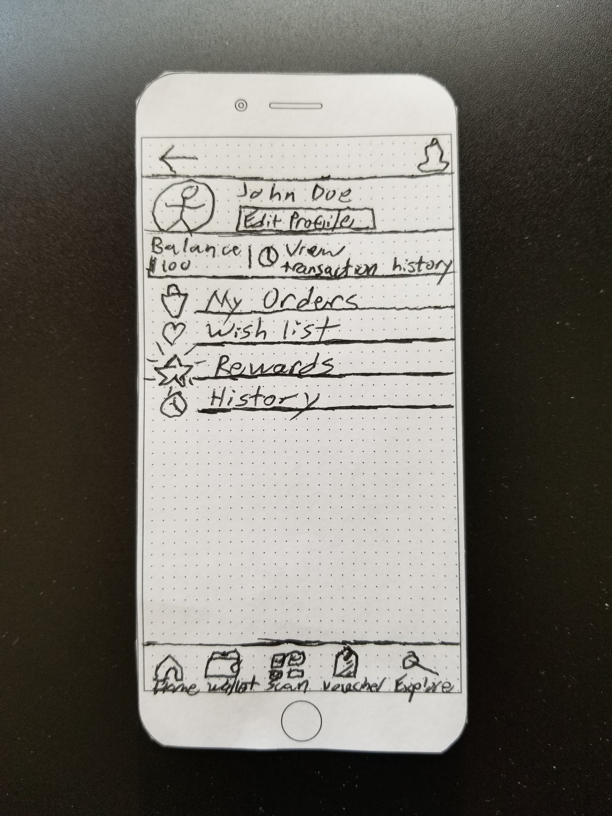
When I began sketching I realized scanning QR codes will be the most used feature and needed to be more accessible. I removed the scan feature out of the home section and gave it its own section in the middle of the primary navigation.
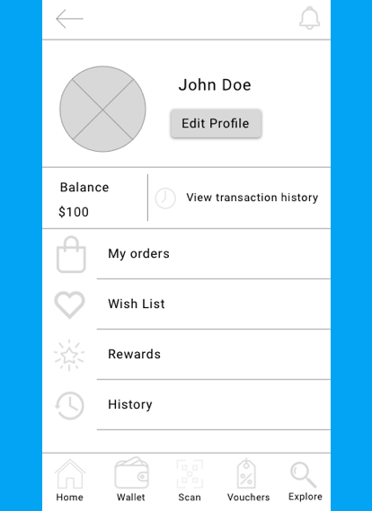
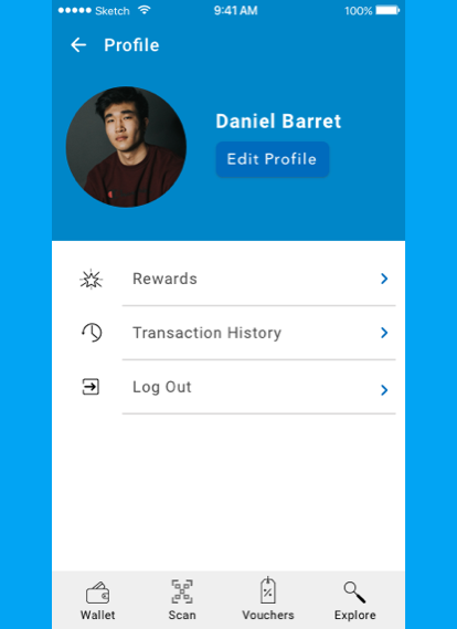
I also took the profile out of the home section and put it in the top left of the app knowing that users will often want to see their personal info and balance.
Low Fidelity Wireframes
I created low fidelity wireframes of my sketches and made the screen resolution 360x640, seeing that it is the most used in Thailand.
High Fidelity Wireframes
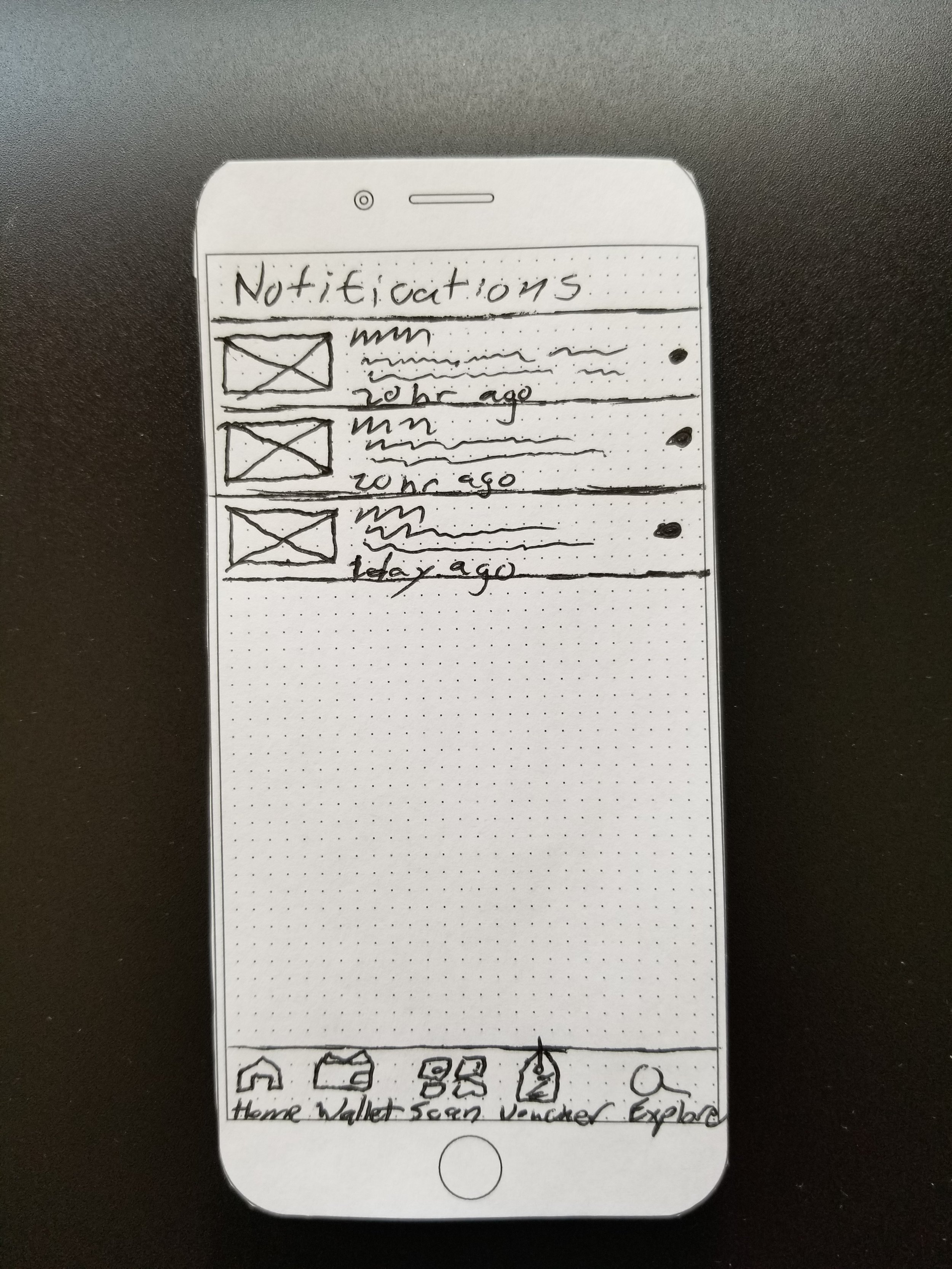
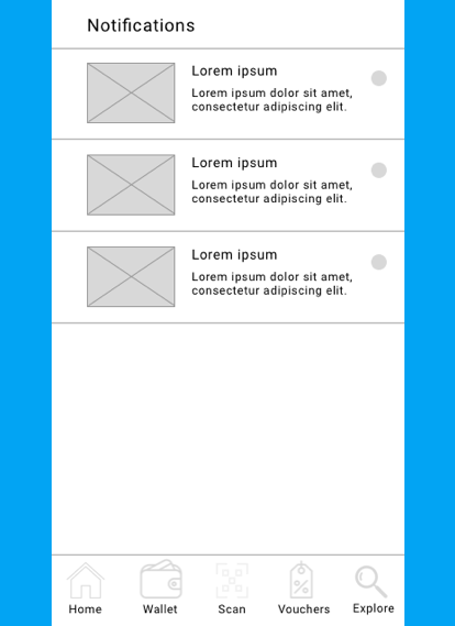
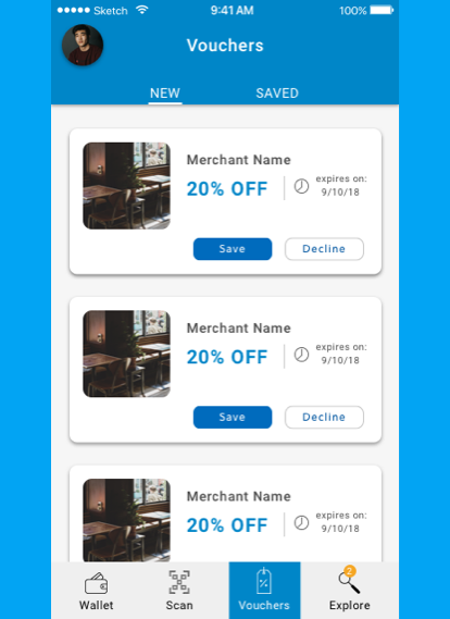
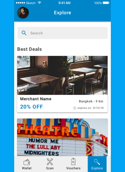
From the low fidelity wireframes I decided to remove the notifications section all together and make numbered notifications on vouchers and explore section so that the user can always see the specific notifications at all times.
Also, since the scan and profile sections were removed from the homepage I decided to remove the homepage all together and make the scan section the new homepage.
Prototype
Next Steps
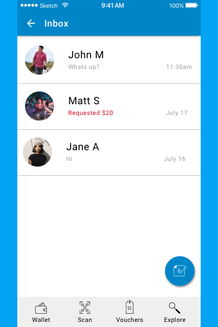
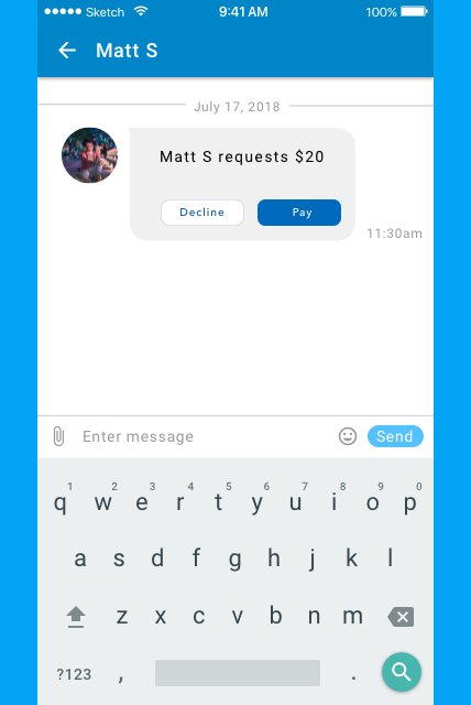
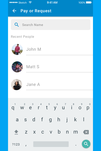
In the future I would like to include features such as messaging and pay or request money. This will allow users to easily pay or request their contacts within the app and keep track of payment history.


