The Brief
inPHormed is a recruitment review platform where Overseas Filipino Workers or OFW's can search, rate, and review agencies. Their mission is to end labor trafficking by helping OFW's determine which agencies are safe from agencies that are unsafe.
Role
Ux Designer | Lead Researcher
Platform
Mobile
Timeline
3 weeks
Team
Jason Nishime,
Jozef Banuelos,
Liz Glick
Work type
Freelance
Discovering OFW's
Initially, I asked myself who do I need to interview? Immediately I thought of people I know who work abroad who are teaching English but once I started doing research I realized that the target user needed someone who is working overseas because there are minimal opportunities in their home country.
Finding people to interview was a challenge since I did not know any OFW's so I had to get creative on how to find these individuals. I overcame this challenge by researching more about overseas workers and soon discovered that there were many communities on facebook.
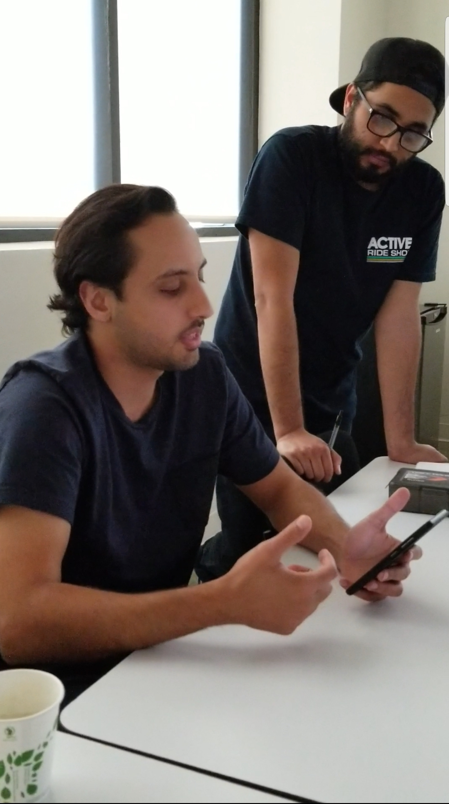
Even though I found these communities it was still difficult to get interviews with these individuals due to constraints of different time zones, individuals with traumatic experiences and weren't open to an interview, and some were simply just too busy to talk. But in the end I was able to get 2 interviews which I was still able to gain a lot of insight from.
C&C Analysis
Due to lack of user interviews we relied on researching other recruitment agency websites and websites that had an adequate review platform in which we created 2 types of C&C Analysis that focused on features and layout.
Facebook Chatbot
Upon my discovery of finding overseas worker communities on Facebook I knew that Facebook was one of the main sources that they utilized to gain information and to reach out to other people in similar situations. I created a chatbot to help overseas workers answer survey questions about past experiences they had with a recruitment agency.
Gaining Empathy
It was difficult to gain trust from people that have no clue who I am or what my intentions were. I had a few people that stopped talking to me half way of the interview because some of the questions were hard for them to answer or too personal to tell someone they just met. After the few initial interviews, I changed my strategy and started to get to know these people and empathizing with their story before asking them any interview questions. Also, I offered to help them by researching any information I could find that might aid them in their current situation.
Meet Tala
Based on the insights I gathered from user interviews I discovered that many of these overseas workers were women working overseas to provide for their family. With this discover we were able to come up with a persona Tala.
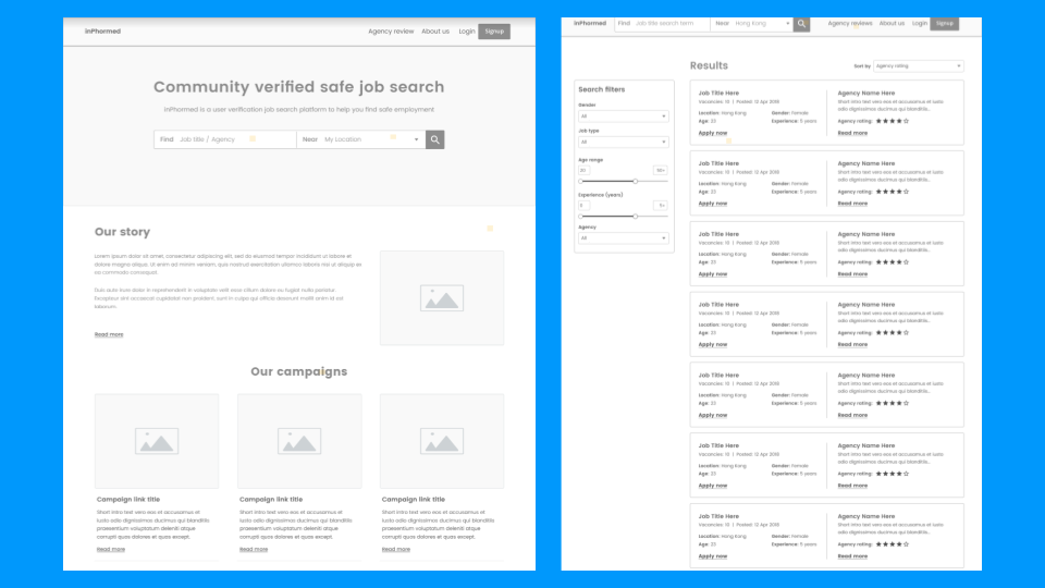
Pre-existing Wireframes
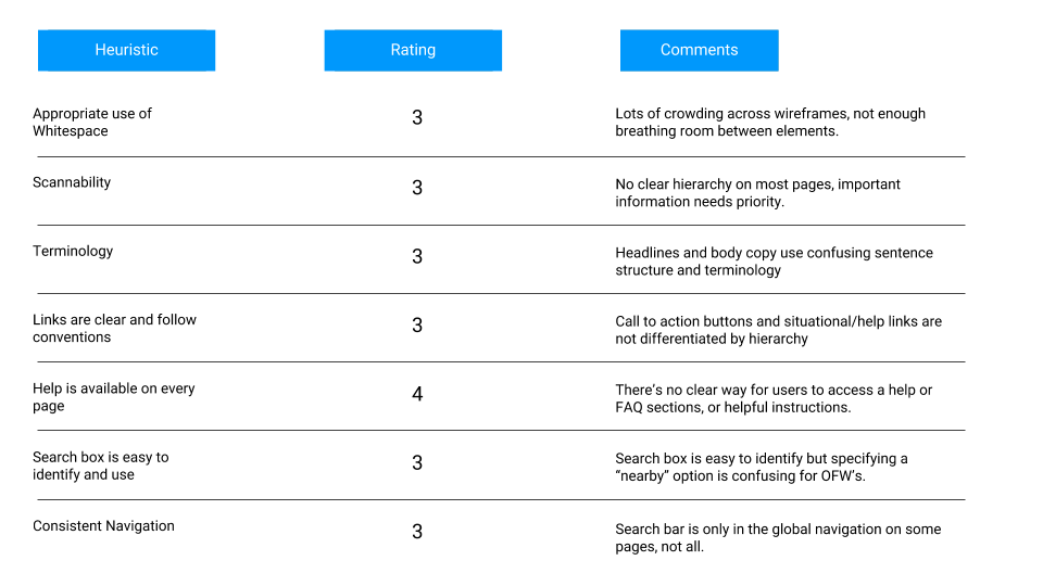
Our stakeholders provided us with pre-existing wireframes and we wanted to see what we could use and what need to be changed so we conducted a heuristic evaluation. It was also a way for us to explain in detail to our stakeholders why we needed to make changes and how we were going to do it.
Feature Prioritization & Card Sort
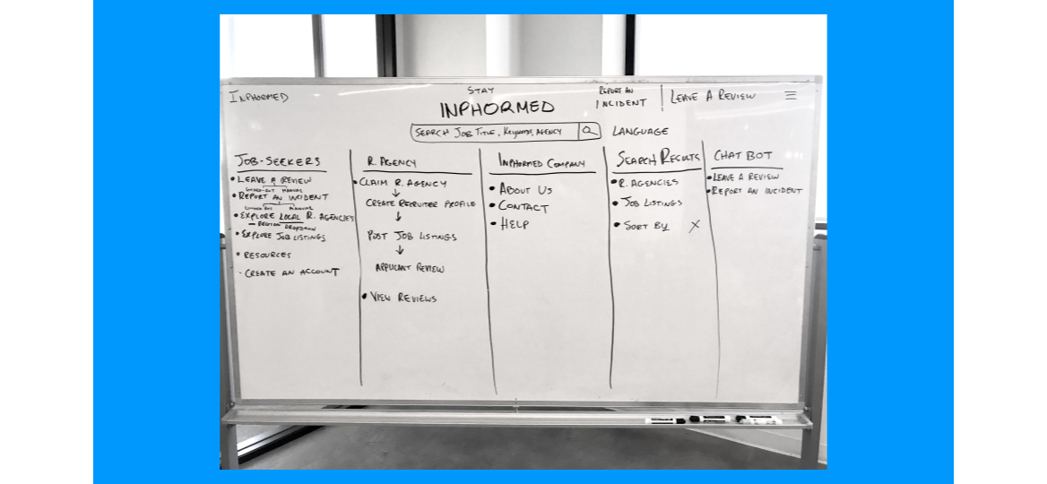
After all our research, we prioritized features for our MVP. As we were creating the feature prioritization, we realized our scope was too wide and discussed how we could narrow it down in order to best serve Tala.
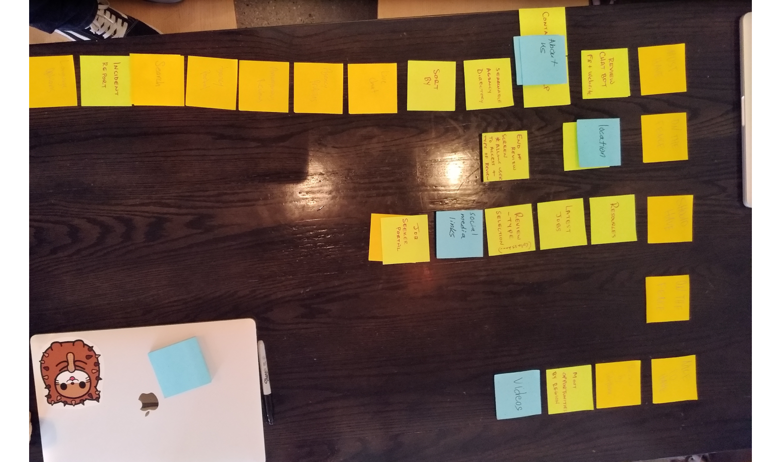
Once we we laid out all the features we conducted a card sort to see if which features were necessary for our MVP.
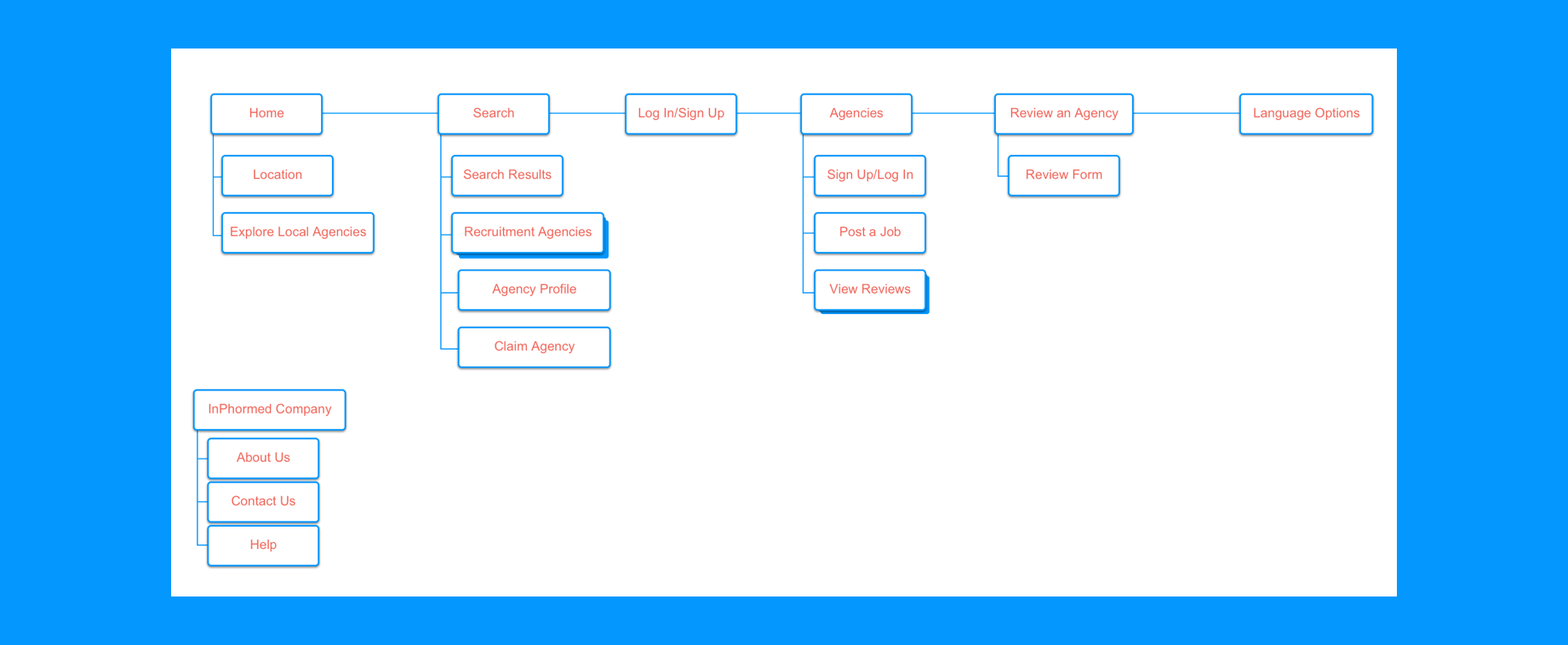
Site Map & User flow
Once we narrowed down to the essential features we built a sitemap. Here you can see the hierarchy of features of the home page.
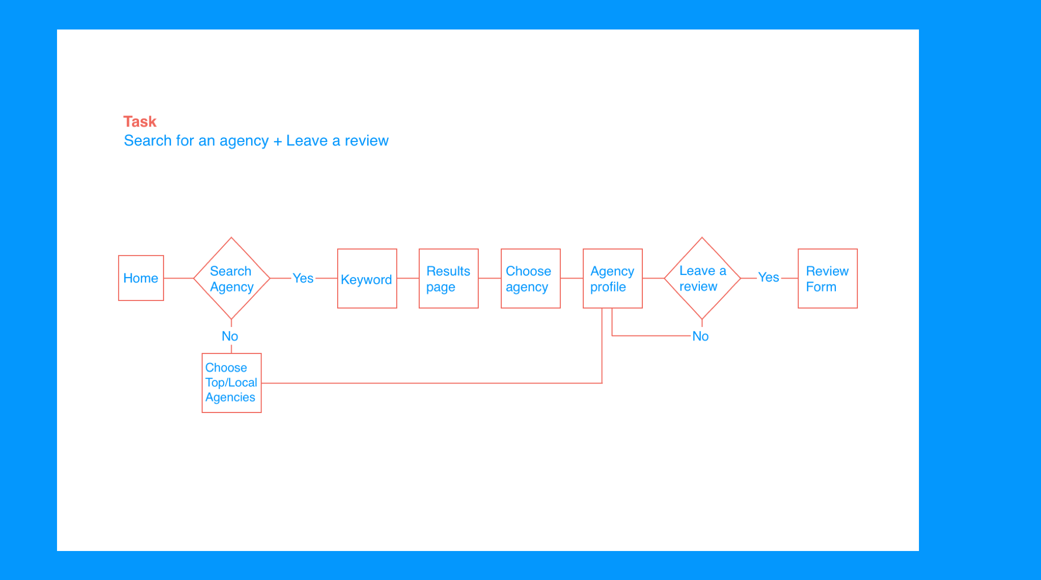
Once we had a clear navigation of the app, I created a user flow to show Tala's ideal path to search and review a recruitment agency.
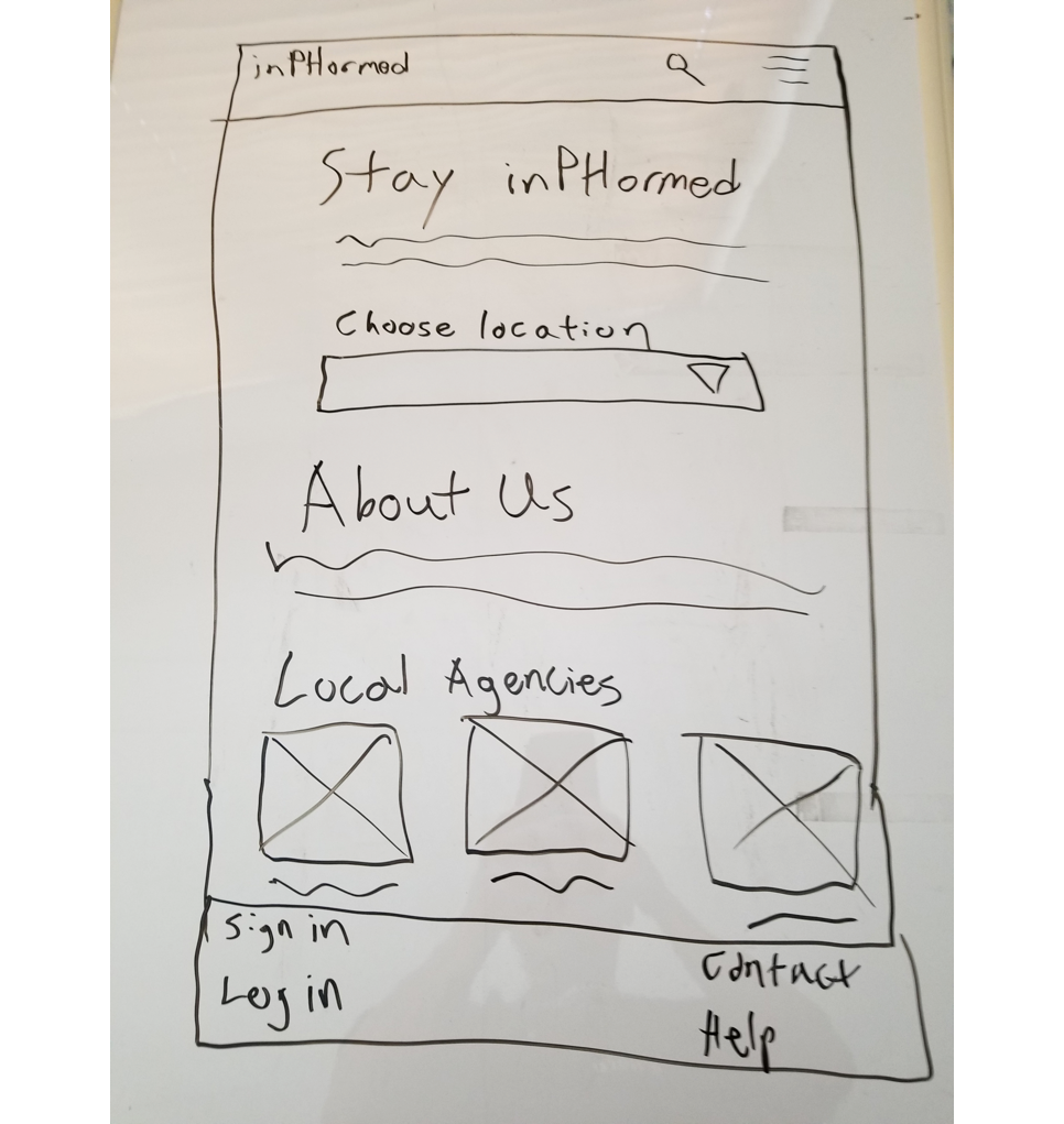
Sketches
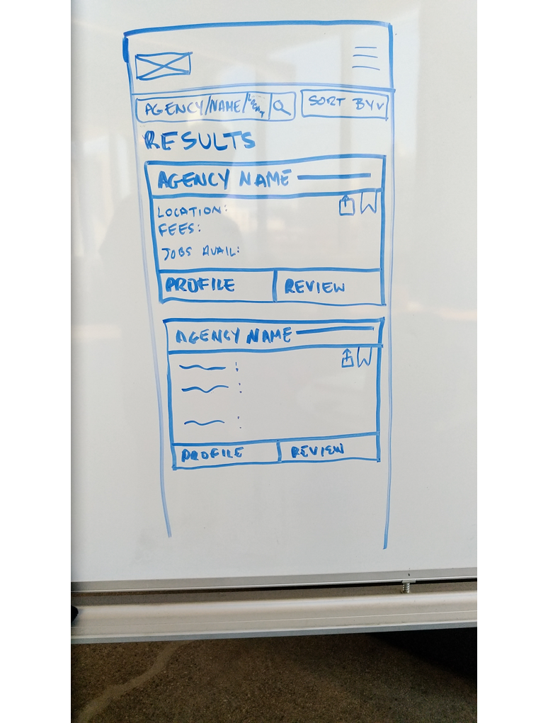
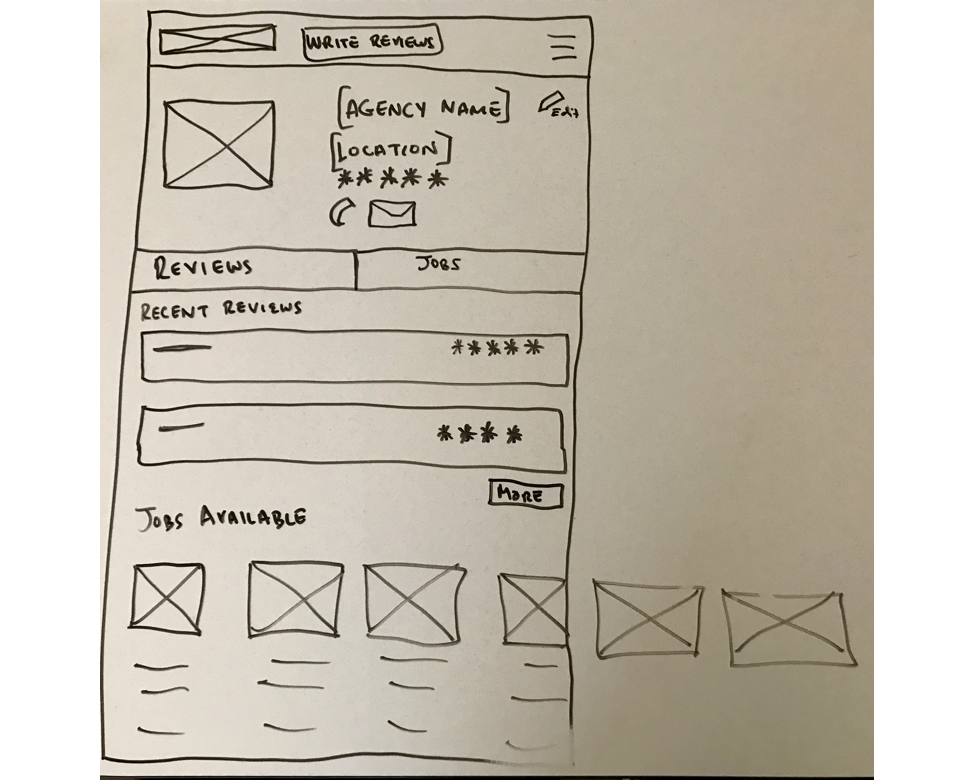
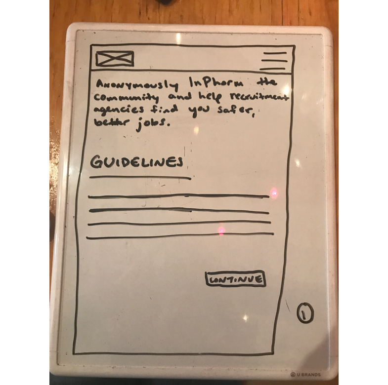
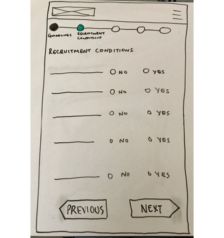
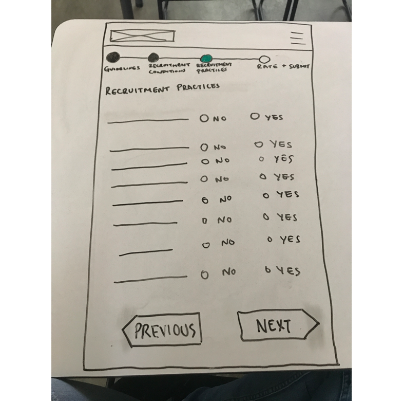
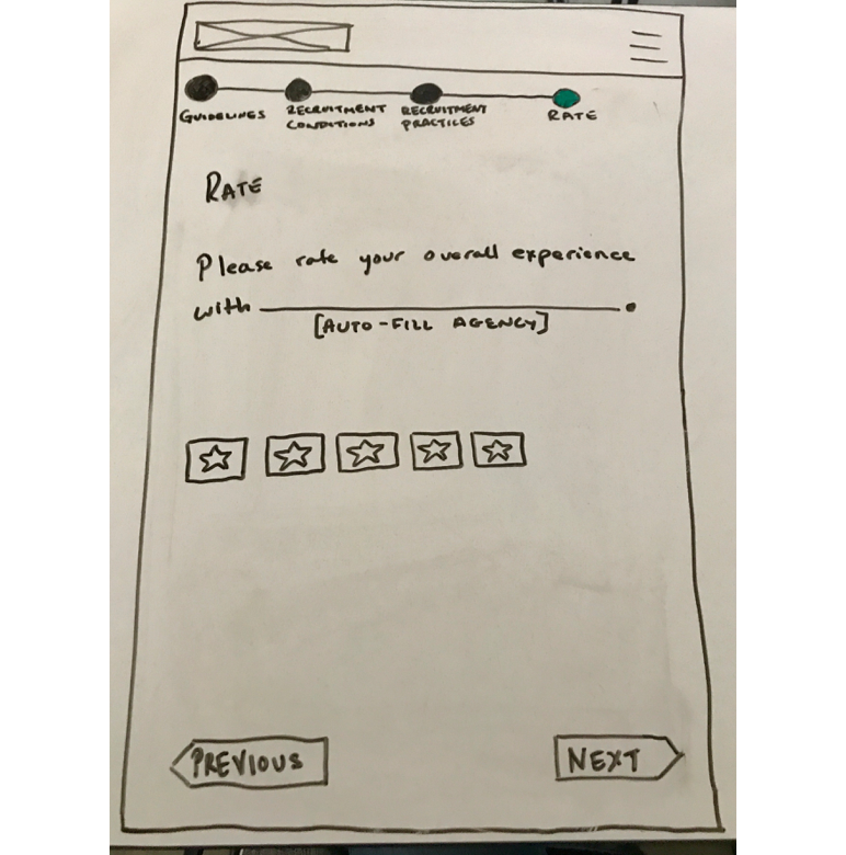
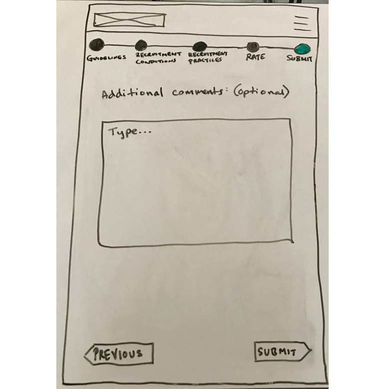
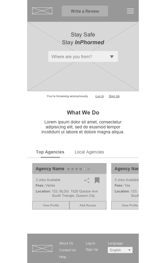
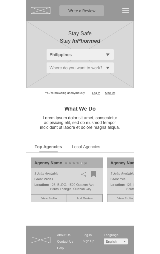
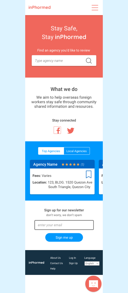
Given all our research and synthesis, we conducted a design studio and began ideating solutions for Tala. I designed the sketches for the homepage and suggested it would be beneficial to have local agencies with good reviews on the homepage so users can easily access the best agencies in their area.
Med-Fi Wireframes & Usability Testing
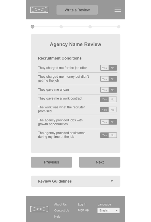
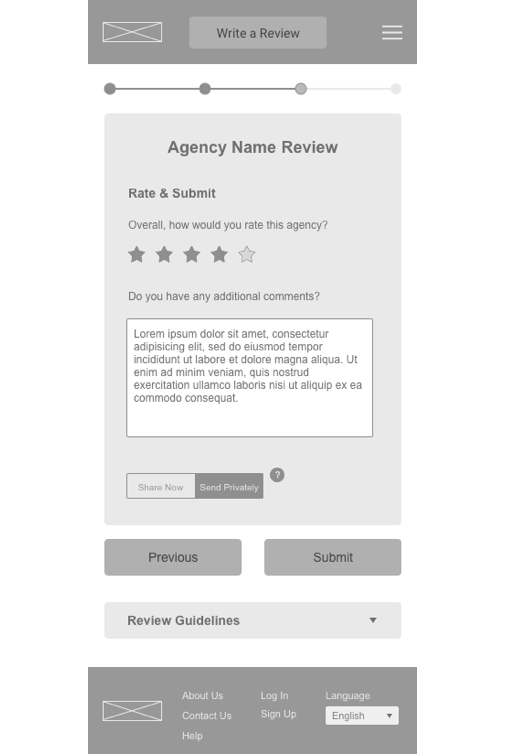
From our sketching, we created medium fidelity wireframes. Since it was difficult to get user research, we were making educated assumptions to our solutions. So it was necessary to prototype our wireframes and conduct usability testing.
Hi-Fi Wireframes
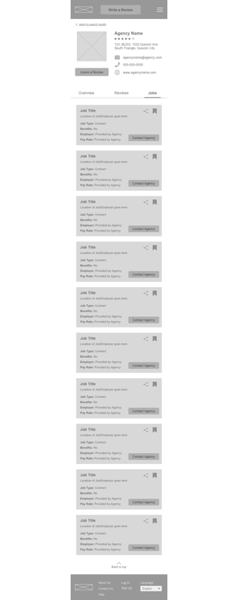
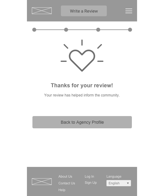
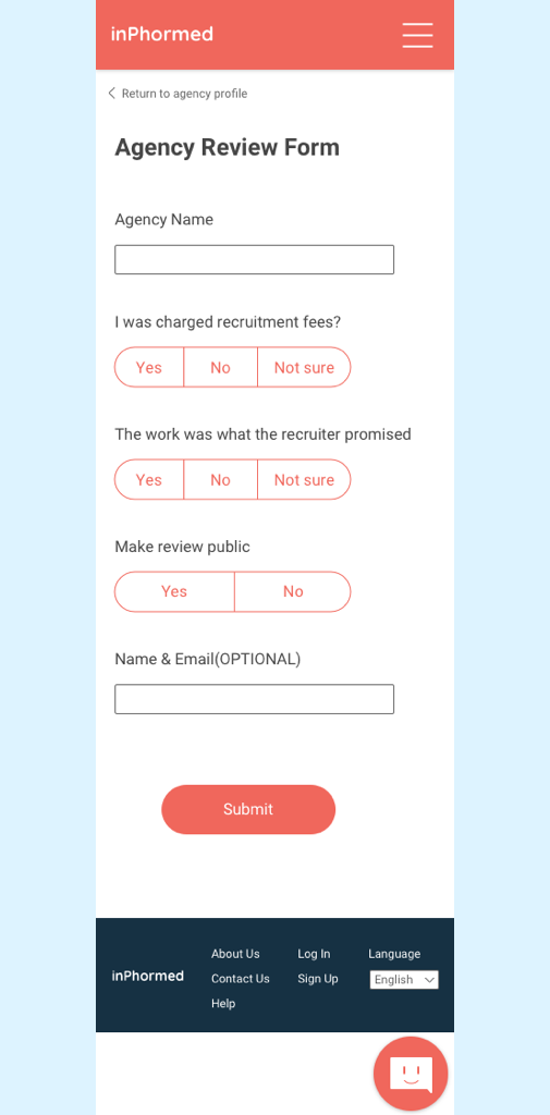
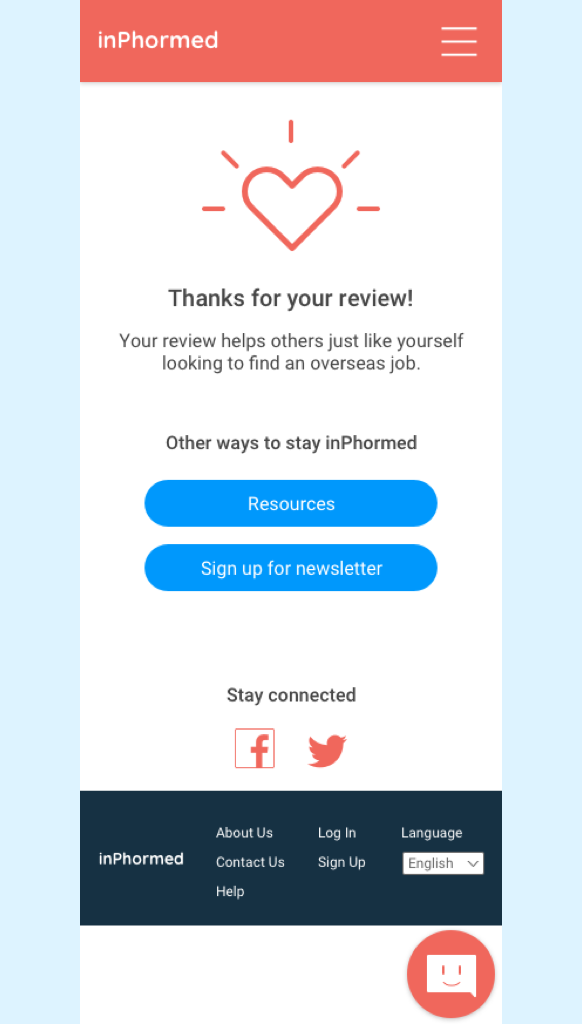
When we finished conducting usability testing we realized we had to narrow down our scope. Since the platform is to search and review an agency we removed the jobs tab and shorten the review questions for our MVP.
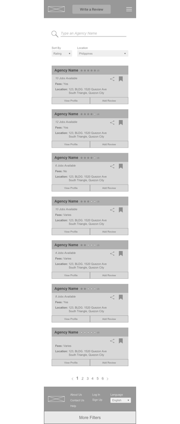
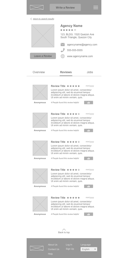
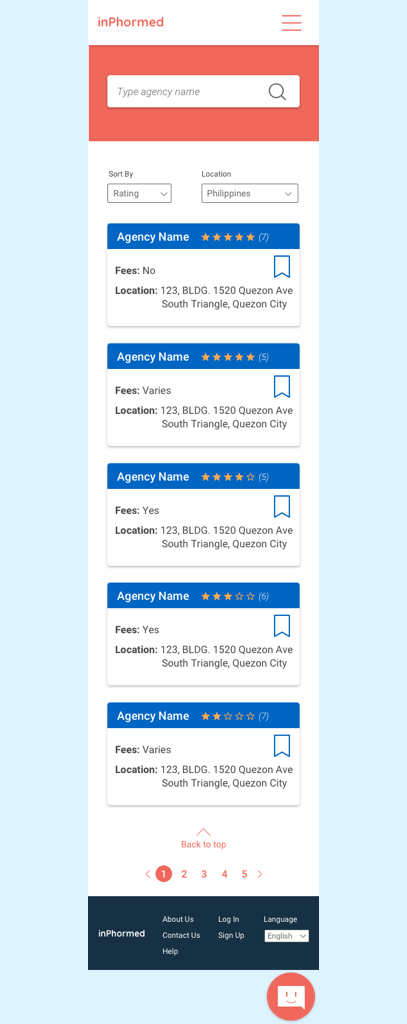
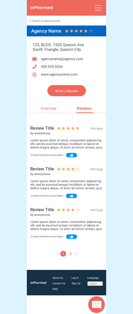
I designed the agency search screen and made each agency as a card with general information and added a star rating and bookmark. I also designed the reviews tab on the agency profile screen where ofw’s can see all the reviews of the agency and “like” and give a star rating to the reviewer or agency.


