
What is GetBackd
GetBackd provides businesses with fast and easy financing solutions that traditional financial institutions cannot offer. They specialize in providing tailored financial solutions for small and medium-sized business enterprises.
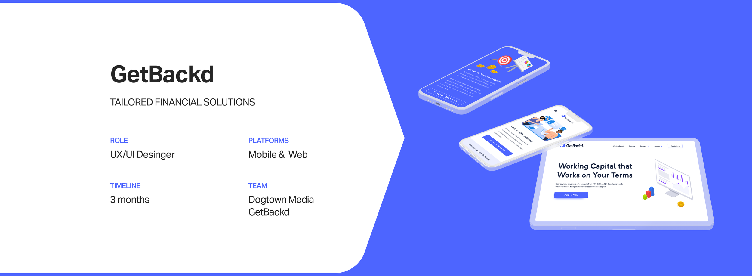
Project Overview
Their website needed to be updated with more compelling content and have a cleaner visual design. I developed a redesign of their website and made it to be mobile-responsive.


Problems
The top of almost every landing page has stock images which is an outdated practice for new products and is hard to read text and buttons over images
Sections with image assets don’t communicate the points and have no sense of order to convey the concept
Accessibility issues: details are really small and easy to miss, image quality on some sections doesn’t have great resolution, colored text titles are hard to read
Sections that explain how the product works are hard to understand and don’t have great selling points

Design Recommendations
The client provided the pre-existing website. To improve the website, it was essential to conduct a heuristic evaluation. It was important to document all the issues to devise solutions to improve the designs. Also, this helped provide recommendations to the client and explain in detail why we needed to make changes and how we were going to do it.

Emphasizing The Product
One of the main discoveries made was that it was difficult to understand the product and the services it offers. Also, the website didn’t do a great job emphasizing selling points. I researched companies that did this correctly and collaborated with our copywriter to update the text copy to make it more welcoming and compelling.
Companies that are easy to understand the product, have great selling points, and are user-centered

Implemented updated text copy after reviewing the companies and seeing what they did right and wrong


Landing Pages
The landing pages for each section had a full-size image with text on top which made it really hard to read the text. Also, they had a stock image feel, so I wanted to update them to give a cleaner and more compelling look that doesn’t detract from the text copy.

Stat-driven Content
Every section of the pre-existing website was very text heavy. One of the ways I broke this monotony was wherever there were sections that spoke on statistics; I isolated those statistics and designed them to be eye-catching, more compelling, and digestible.


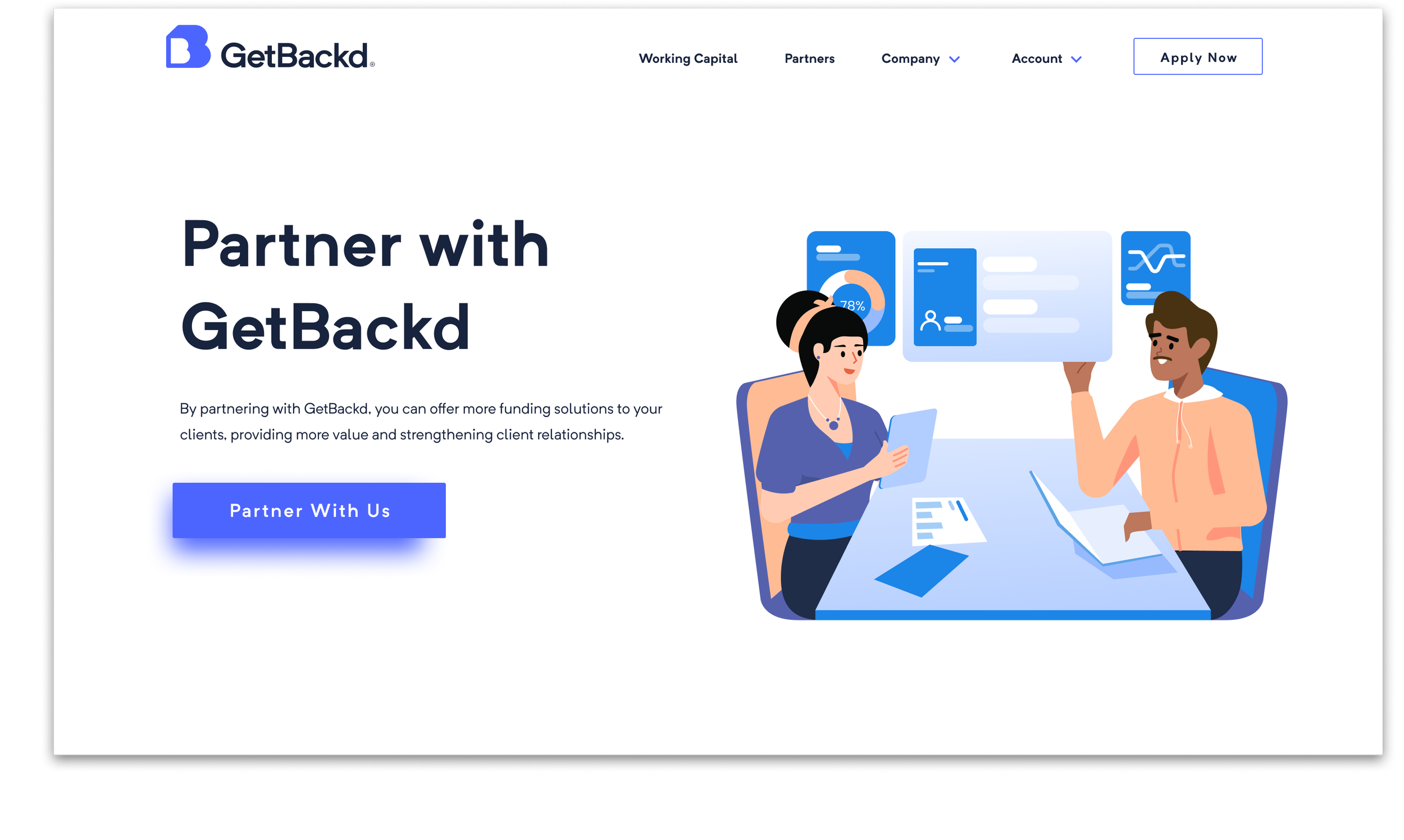
Illustrations
Other sections of the website also had stock imagery issues and to keep consistent with the new landing pages, I created vector illustrations that did a better representation relating to the sections.


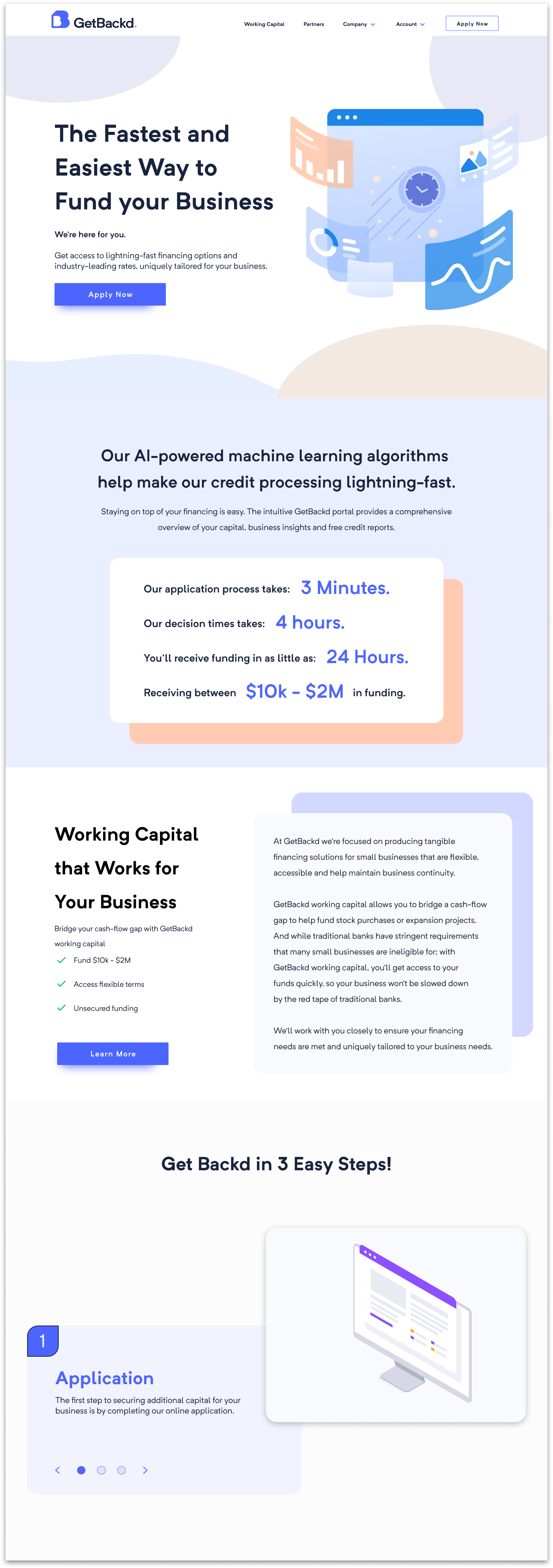
Homepage
Landing Page Vector Illustration
The final homepage has a cleaner visual design incorporating vector illustrations, and the content is understandable and welcoming.
Application Statistics
To keep users engaged and to prevent them from being overwhelmed by starting an application, I showcased statistics on how fast to complete the application and the benefits of accessing the Getbackd portal.
Call To Action of Features
I added selling points with a call to action so the user can quickly understand the feature and isolated the full details to give the user the choice to get the whole picture.
Step-by-Step Animations
A carousel module under “Get Backd in 3 Easy Steps!” allowed customers to cycle through each step with animated graphics for each step.
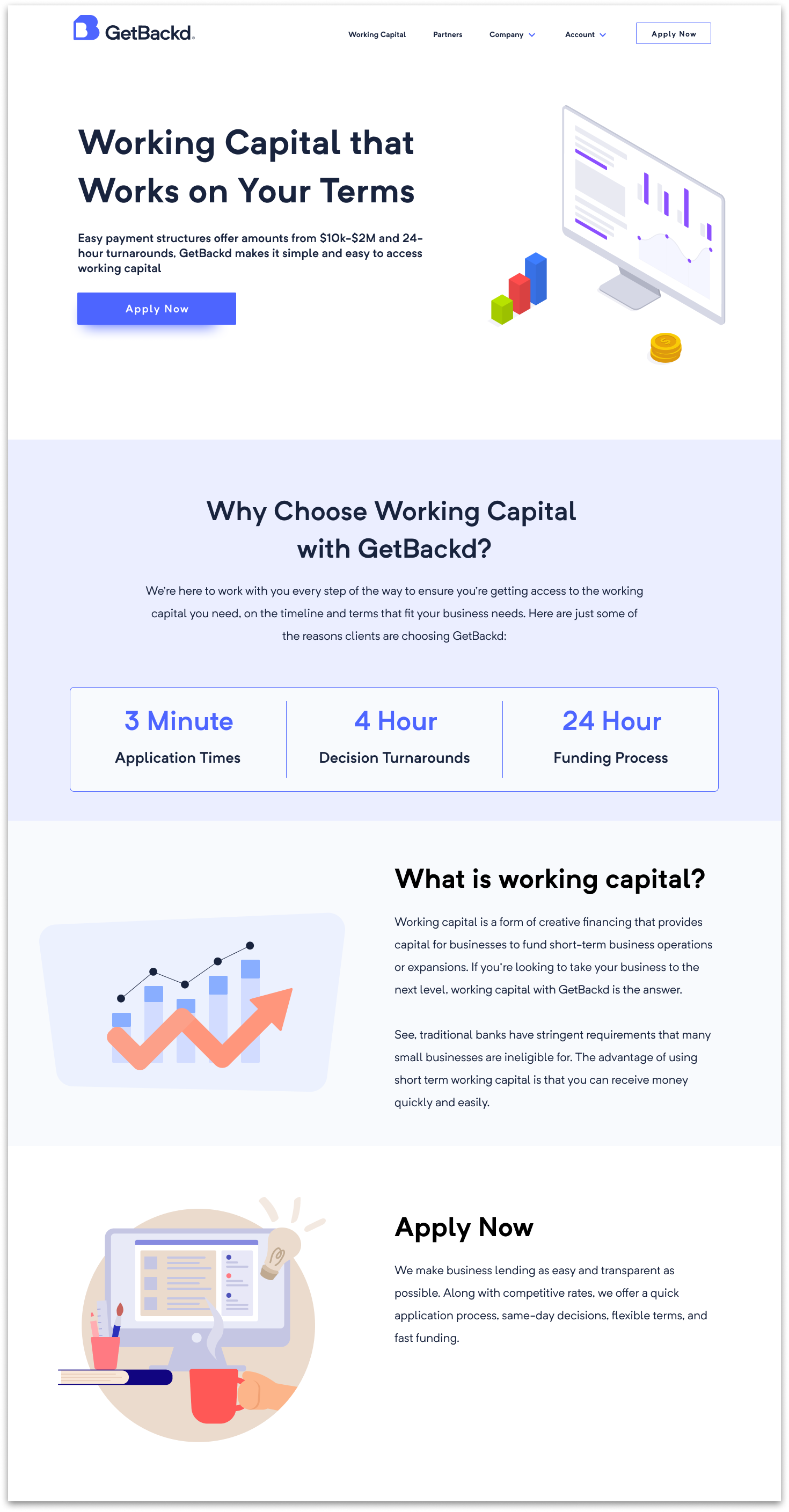
Working Capital
Landing Page Vector Illustration
Working Capital is the main feature of Getbackd, so it was important for customers to understand the content and incorporating graphics that best represented the feature.
Benefits Statistics
The statistics in Working Capital is similar from the homepage. The content demonstrates the benefits of accessing the working capital that the user needs.
Illustrations
Added vector illustrations for informational sections to help paint the picture.
Animations
I added animations for sections that had step-by-step processes. These sections explain the process of each service, so it was necessary to make these sections to be more engaging and easier to comprehend.
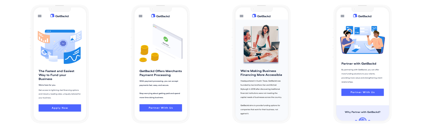
Mobile Responsive Designs
This product was not a native application, and with the new iterations and animations, it was essential for the new website to be responsive for mobile.