


What is Marathon Health?
Marathon Health has multiple onsite health centers and provides patients with tools to manage their health. Their service changes how healthcare is delivered, with features that will help keep people healthy and prevent them from getting sick.
Project Overview
They came to Dogtown Media with a task to create a mobile app experience for their existing website and recreate features to be more intuitive for the patient.

Existing Website Issues
Marathon Health already had an existing website, I was tasked with taking the features from the website and designing an app version. Some of these features had a lot of information and took up a lot of real estate on the desktop screen. It was a challenge to condense these features for the app but implementing a new information architecture helped organize them and where they will live in the app.


Jump to a more in-depth look of these issues and the solutions
HOME - Simplifying The Home Page
APPOINTMENTS - Restructuring Layout And Process
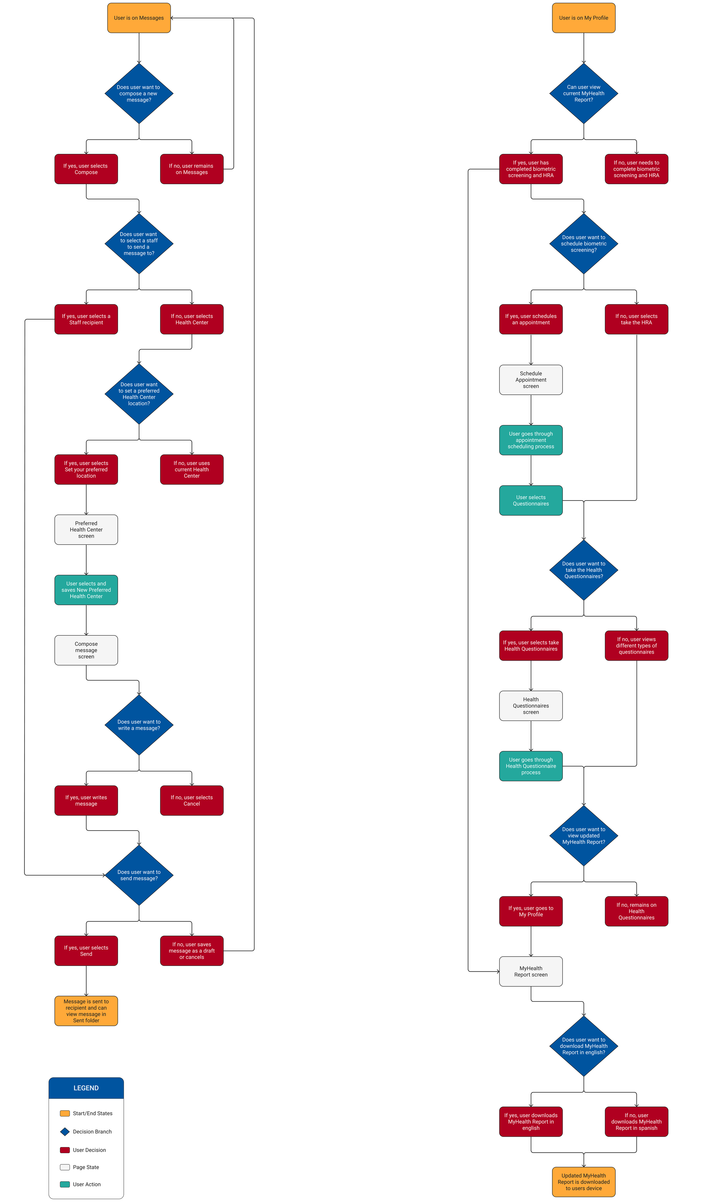
User Flows
Another critical issue of the website was the navigation of features was unintuitive and wouldn't be transferrable to a mobile app. It was evident to start with devising user flows for the main features to create a seamless process and an intuitive navigation.
Compose a message
Scenario: Composing a message to a staff recipient with the option to set a preferred health center
MyHealth Record
Scenario: Scheduling a biometric screening and taking a health questionnaire to view an updated MyHealth report
Site Map
Once I understood the functionality of each feature, I created a Site Map to determine the appropriate placement for each section and how they connect.

Initial Wireframes
Once I completed the information architecture, I utilized the user flows to create intial wireframes and helped me fill in the gaps for the rest of the flows of the features.


The home page has the user’s information and the health center that they chosen. The website has an overview of the other features and makes the homepage cluttered with information and is overwhelming. By clicking the titles of each overview of features will take the patient to the main page of those features, but the functionality is not apparent. For the app, the features are grouped in a list form and have arrow chevrons to depict that selecting will take the patient to that feature.

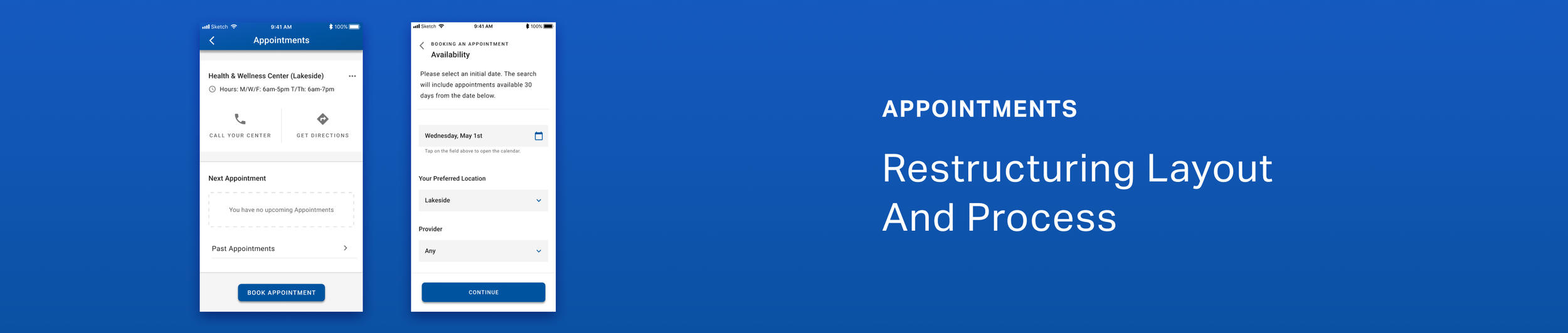
The Appointments section shows the patient's primary Health & Wellness Center information and the patient's appointments. Similar to the home page of the website, there were many alignment issues in which made it hard to focus on the information.
Also, there is disorganization with current/past appointments as well the Search For Appointment function should be more apparent in that this is the primary function of this section. To solve these issues in the app, I separated current/past appointments so that they have their own individual sections and put the Book Appointment button at the very bottom in its own space to be more apparent.

Client Approved Screens
Once the UI went through a final review from the client, it was then ready to be developed with our development team and was released to the App Store and Google Play Store.

Final Thoughts
A SOW between Marathon Health and Dogtown Media was agreed upon to complete this mobile app. Having an SOW in place added constraints throughout the project upon making discoveries that could have utilized UX methodologies that the SOW did not include. Ultimately, I recommended some non-SOW UX methodologies that were necessary to include, but some couldn't due to time and budget.
Here are implementations I would add if the project allowed for more time and budget:
User/Usability Testing
Facilitating usability testing would help identify issues throughout all phases of visual design and would be able to make iterations more efficient. User testing would help gain insights if any features were difficult to understand and help identify issues with the functionality and navigation of the app.

Website Redesign
The new mobile app proved more intuitive and had a cleaner aesthetic, and it will be confusing to have an outdated website with the new mobile app. It would be essential to redesign the website to ensure that styling, functionality, and navigation are consistent with the new mobile app.